Edgar Degas exhibition: Degas and the ballet: picturing movement

3

Since the 17th of September  a new exhibition about Edgar Degas has opened  at the Royal Academy of Arts in London. The exhibition focuses on Degas‹ interest to capture the movement of dance and puts his approach in the context of photography and film.
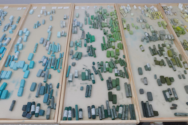
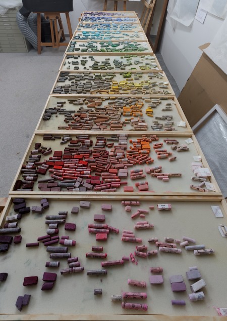
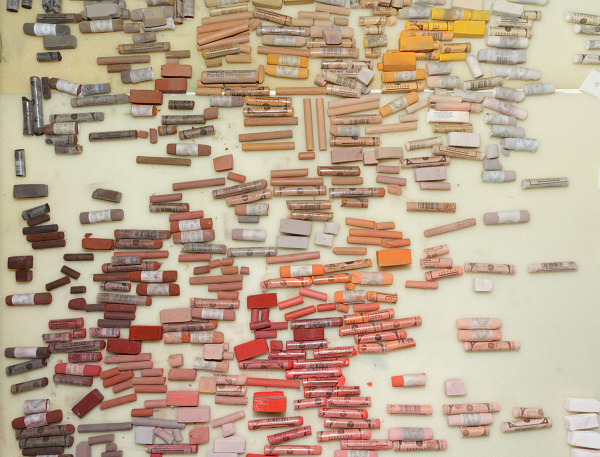
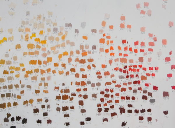
A realy good review about the exhibition was done by Katherine Tyrell Degas and the Ballet: Picturing Movement and further thoughts The Degas Exhibition: notes for pastellits. If you are a pastel painter, do stop by.

Interestingly parts of this exhibition was on display in Hamburg/Germany with the title, Intimicy and Pose. But the great pastel paintings were not included.

I followed one of Katherine links, where Alastair Sooke: How Degas captured movement has done a very interesting video about the exhibition.

Clouds

3

Ziehende Wolken
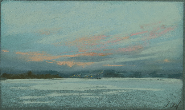
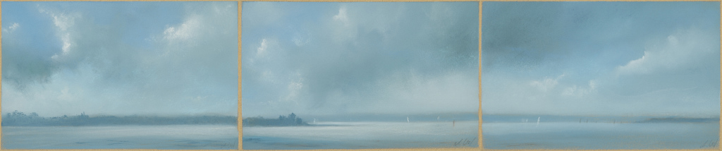
Ziehende Wolken (Triptychon), je 13×21 cm

What makes a place special for an artist? What keeps him/her coming back to this place? That’s hard to explain, but sometimes there’s some kind of magic in the air.

One of those places is the view to the headland of Holnis at the Flensborg Fjord. On this day it was quite windless and those big clouds moved slowly across the sky.

Red bow

3

Roter Bug - Studie
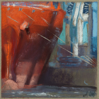
Red Bow,  5×5, pastel,
© Astrid Volquardsen, 2011

This is a sketch for a bigger pastelpainting.  I would have never thought that one day I might say I don’t have enough oranges or reds on my palette, because I have so many.

Max Liebermann: Summer House at Wannensee Lake

2

The Berlin painter Max Liebermann (1847-1935) is known to be one of the painters who brought the impressionistic painting style to Germany. In his last years he had built a summer house on the Wannsee lake in Berlin. There he painted over 400 oil paintings and pastel sketches making the garden to his main theme in his late work.

Liebermann Villa (4)

© Astrid Volquardsen, 2011

In 2004 we had a really good exhibition in my hometown Hamburg just about these paintings and his garden which was designed to his ideas. He had done some great paintings of a birch alley, which I fell in love with.
Liebermann Villa (1)

© Astrid Volquardsen, 2011

In the year of 2006 the house and garden could be opened to the public. Till then the Liebemann villa was leased to a diving club and only after massive protest it was made possible to turn it into a Museum and reconstruct the house and garden.

Liebermann Villa (2)

© Astrid Volquardsen, 2011

Finally I have made it to this most beautiful ensemble and did spent there entirely six hours. When they did the reconstruction of the garden they also planted a new birch alley along the path and when I saw it I instantly knew what must have catched Liebermanns‹ eye.
I sat down there and tried to do some sketching but unfortunately some (more) mosquitoes were biting really bad. I wondered if Liebermann did have the same problems?

Arranging my palette III

4

Pastellablage (2)

© Astrid Volquardsen, 2011

To store my pastels I decided to build some long boxes without any space holders. This way it is much easier to follow the color wheel. Further more some colors take more space and others less, so I can be much more flexible arranging them.

Pastellablage (1)

© Astrid Volquardsen, 2011


I wanted to keep to the scheme of the color wheel and I am glad I could manage that within my studio. I had only to add space for two more boxes.

Arranging my palette II

8

After approxomately 20 hours of work I have rearanged my palette and I am glad that I finally came around to do this. Sometimes it was very tirering but on the other hans I have discoverd many beautiful colors, of which I had now idea I do posses them.

Pastelle (1)

© 2011, Astrid Volquardsen

I sorted the pastels according to the color wheel. Each pastel I marked on a piece of white paper and noted down the brand  and number so I might be able to find it more easily. If you put the sheets of paper next to each other you can clearly see how fascinating it is to the the color change within the wheel. How the reds evolve from yellow-red, to torange red, etc. Of great help was the Huechroval Color Chart. This is a color notation system of 24 different pastel brands based on hue, chroma and values. Unfortunately it is no longer available.
Pastelle (3)

© 2011, Astrid Volquardsen

Doing this has increased my understanding of color a lot and  now I am able to visualise more easily the color within the color wheel. Along the process I had some litte surprises, like finding out that some light blues are actually more like light green. Somehow I never saw the green nuance in it.
Pastelle (2)

© 2011, Astrid Volquardsen

Even though I had the Colorchart for orientation I realised how difficult it is to find an arrangement for the pastels. The color wheel is best seen as a three dimensional system, based on  hue, chroma and value. So how does one arrange this in two dimensions on a flat table?


My dad build some nice long boxes for me and after I have put my pastels in those, there will be another step: Then I need to find my favorites sticks in a completely new place.

1 55 56 57 58 59 60 61 87