

© Astrid Volquardsen
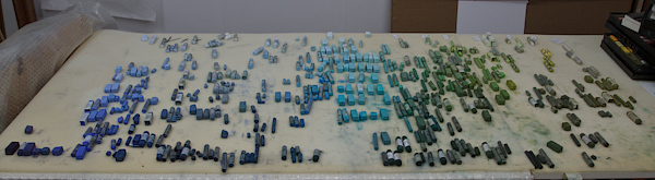
I returned from my trip to the Baltic sea and my sketchbook and head are full of new paintings and ideas. But before I can go back to the easel and start painting I need to rearrange my complete pastel set. The old arrangement didn’t work any longer and I have started to do it properly (which is a lot of work, believe me). My new setup is based again on value, but this time I keep close to the color wheel and I don’t keep the different brands apart. This way I will be able to find much more easily the colors needed.
Sarah Bachhuber Peroutka
Please post another photograph when you have completed the rearrangement! And congratulations on the nice article about you in the recent Pastel Journal magazine.
Astrid
Hi Sarah,
yes I will do that. Thanks for your congrats.
Sam Hannaway
I just got a new pastel box from Dakota which prompted me to do exactly what you’re doing. Ordering my pastels (just as you are) was exhausting. It took at least 2 weeks and made me cross-eyed and crazy. But it was one of the best things I’ve ever done. Somehow, it taught me a lot more about colors and values. Most importantly, it’s made the work much easier and makes reaching for the right stick feel natural.
Great Pastel Journal article!
Astrid
Hi Sam,
you are so right. After 4 hours sorting, I had the feeling my eyes go nuts, but on the other hand I already feel to have reached another understanding of color. Actually I can’t wait to work with this new arrangement.
Thanks, that you liked the article.
Susanne Haun
Das Foto gefällt mir sehr gut, Astrid, wenn ich da an meine Kramkiste denke…. Ich freue mich auch auf weitere Fotos deiner Kreiden!
Grüße von Susanne
Astrid
Hallo Susanne,
ich hatte das Gefühl, dass ich nur noch viele Kramkisten hatte…. das war nicht mal mehr mit kreativem Chaos zu entschuldigen.
Casey Klahn
A new word I picked up is »color solid,« which means a graphic color model. This reminded me of that. Be sure to show us a picture of this arrangement in the box, please.
It makes a beautiful image.
Astrid
Hi Casey,
I am still in the thick of it but it appears more and more to be what you described. The Hue Croval color chart is of extreme help by the way.
Casey Klahn
I saw the HueChroVal book immediately when I looked at the photo!
The translator has ruined my phrase. The phrase I intended in my comment was
ColorSolid
which means a model in 3 dimensions of a color wheel.
Casey Klahn
Ha ha. It did it again. »Color«
»Solid« with the word »Color« first, and the descriptor »Solid« second. I expect that af Deutsche the syntax is different, but I just want your English readers to understand the term the way I wrote it.
Astrid
Hi Casey,
those translators can be tricky, but I appreciate your efforts. I know what you mean….